Lacerna
A wholesale fashion website with the character of a fashion magazinecompany website · 2026
02 // about the project
company websiteA tear that holds the whole system together.
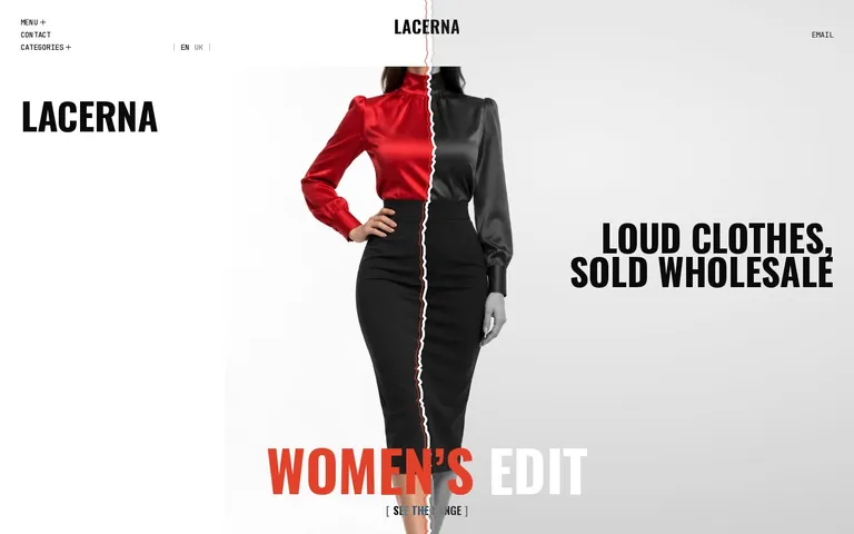
Lacerna sells bold collections to independent stores and boutiques. The name refers to the short cloak Romans wore over the toga, and the Latin lacer means “torn.” That’s where the visual principle came from. A heavy L is split into an ink-black upper part and a vermilion “foot,” photos are torn in half, headings change color, and marker strokes and handwritten captions bring in the energy of a fashion magazine. Sliders and a progress line help navigate the collections without losing that character.
Lacerna got a brand and a website built on one visual device: the tear works in the name, the mark, the photos and the motion. Wholesale buyers see the collections in a format that’s easy to navigate, and the brand keeps its bold editorial voice.
03 // what we did
naming, logo, website design and development- 01
A torn first screen
The color and black-and-white halves of the photo create a recognizable frame for the collection.
- 02
Editorial motion
Marker strokes, shuffled letters and a giant word carry the brand voice as you scroll.
- 03
Sliders with a custom cursor
Brush captions, a DRAG / VIEW cursor and a progress line show how to browse the selection.
- 04
Language pair
The Ukrainian and English versions are linked with hreflang and backed by legal pages.
04 // screens
lacerna.apricode.agency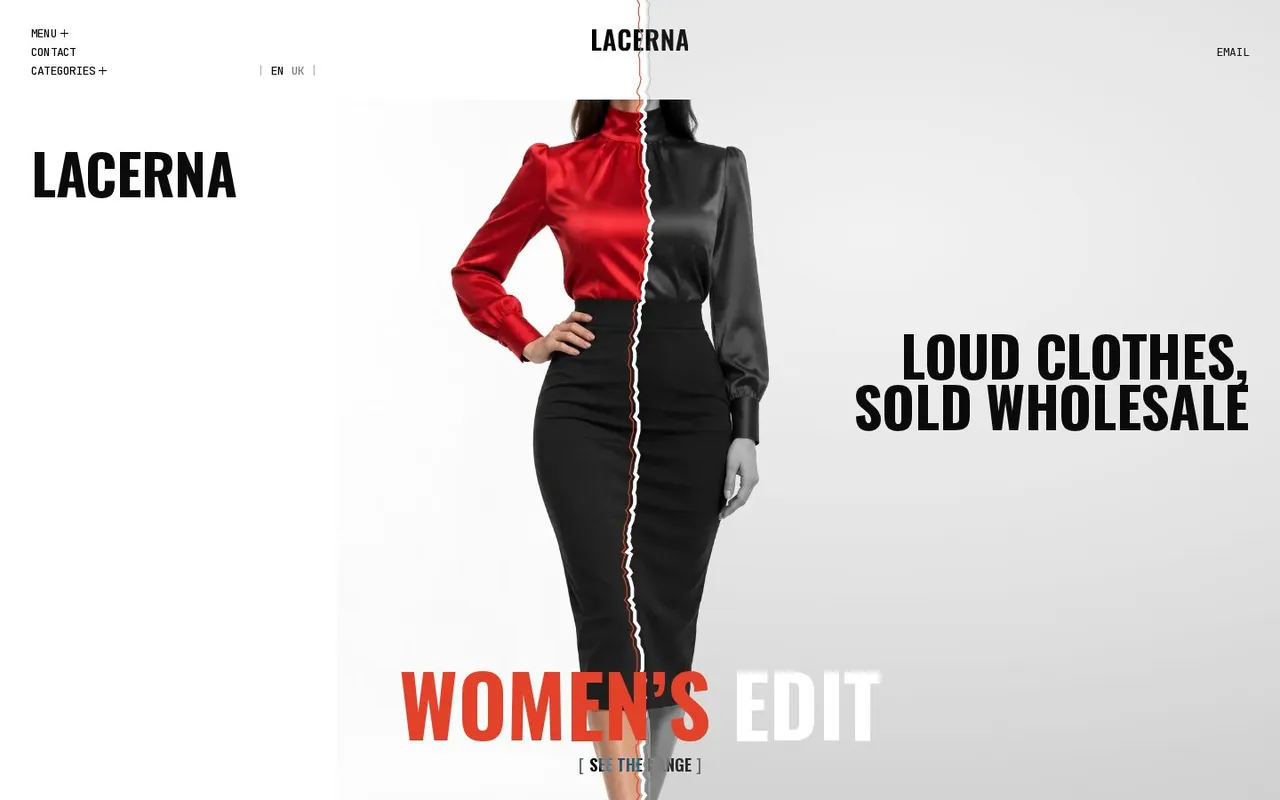
05 // how it works
4 steps- 01
Identity
The name and the torn L set the main device of the identity.
- 02
First screen
The split photo shows the character of the collections right away.
- 03
Collections
Sliders, progress and the cursor suggest how to browse.
- 04
Contact
After the collections, visitors move on to information about the brand and a way to get in touch.
Need a similar project?
30 minutes on Zoom: we’ll go through the task, show how we would do it for you, and name the timeline and cost.