Peleus
- Startup website
- AI
- SaaS
- 3D
Peleus needed to explain a complex AI platform to agencies and marketing teams before launch, and to build a waitlist. We made a website where a 3D core, workflow diagrams and pages for six modules explain the product in a few screens.
Visit website- A 3D product image on the first screen
- Diagrams that explain without text
- A dedicated page for every module
- Easy to read on a smartphone
- Astro
- Three.js
- GSAP
- TypeScript


- Status
- Product in development
- Year
- 2026
- Role
- Website design and development, motion
- Languages
- EN, UK, RU
Clear from the very first screen
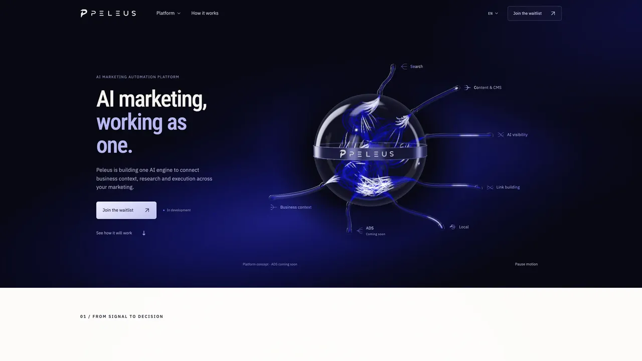
A glowing 3D core with branches to the modules explains the platform without a wall of text: search, content, AI visibility, links, local marketing. Next to it, a single button to join the waitlist.
Decisions from data, not prompts
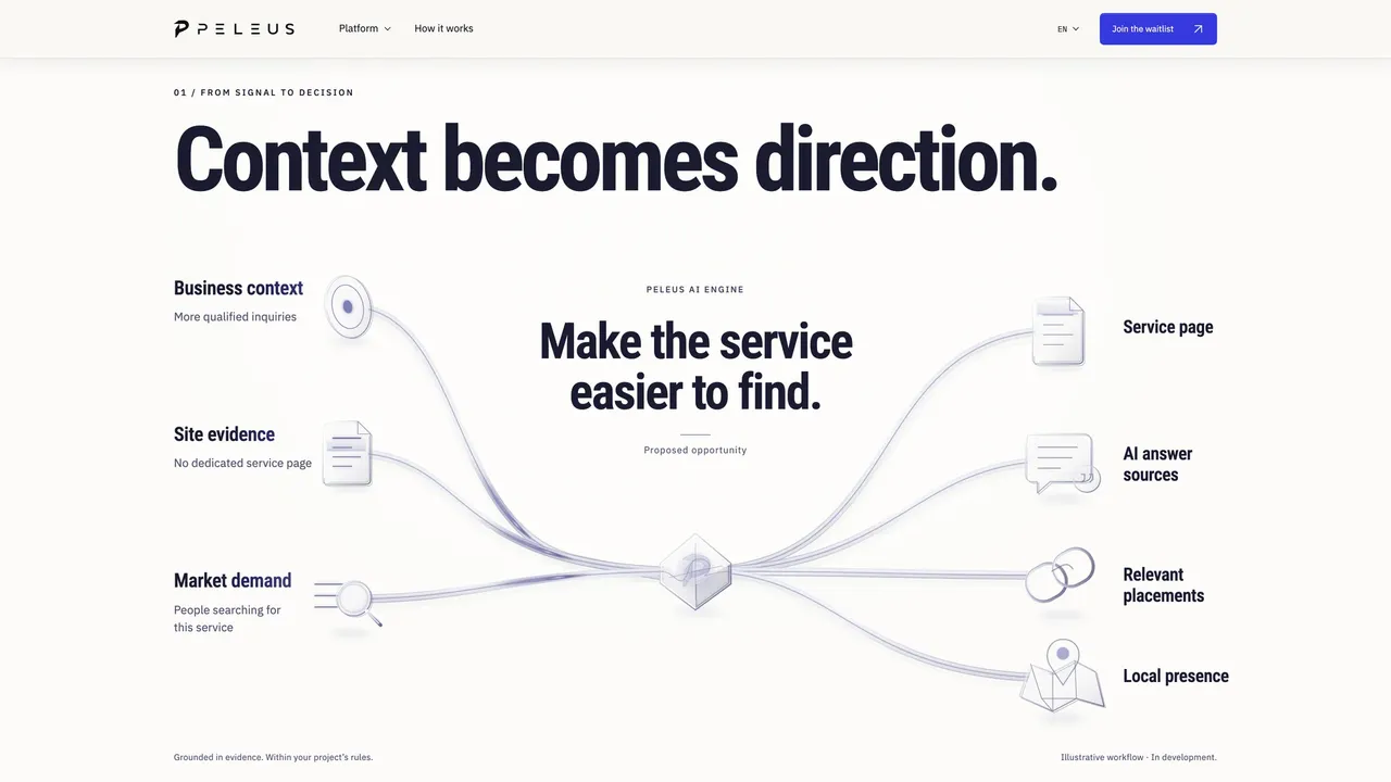
The diagram shows how business context, site health and market demand converge into one recommendation. An agency sees right away where each piece of the platform’s advice comes from.
One plan, four directions
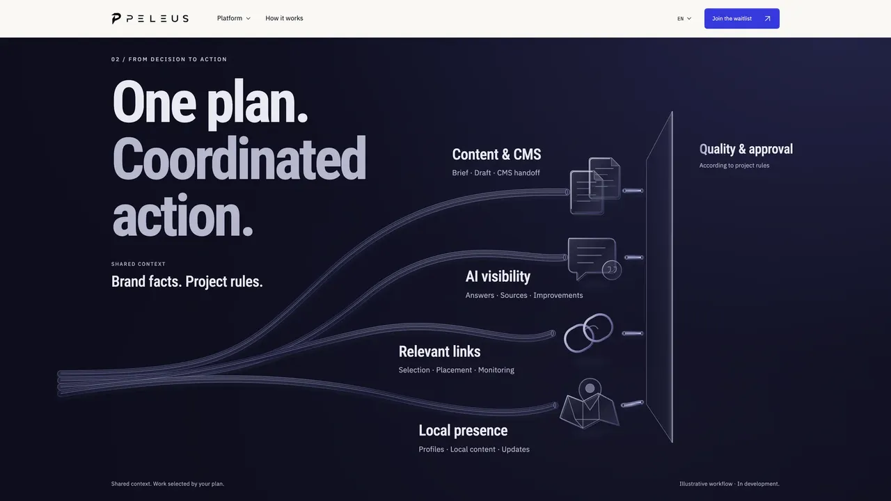
Brand facts and project rules branch out into content, AI visibility, links and local presence. Every branch ends with review and approval, so the team keeps quality under control.
An interface ready to show
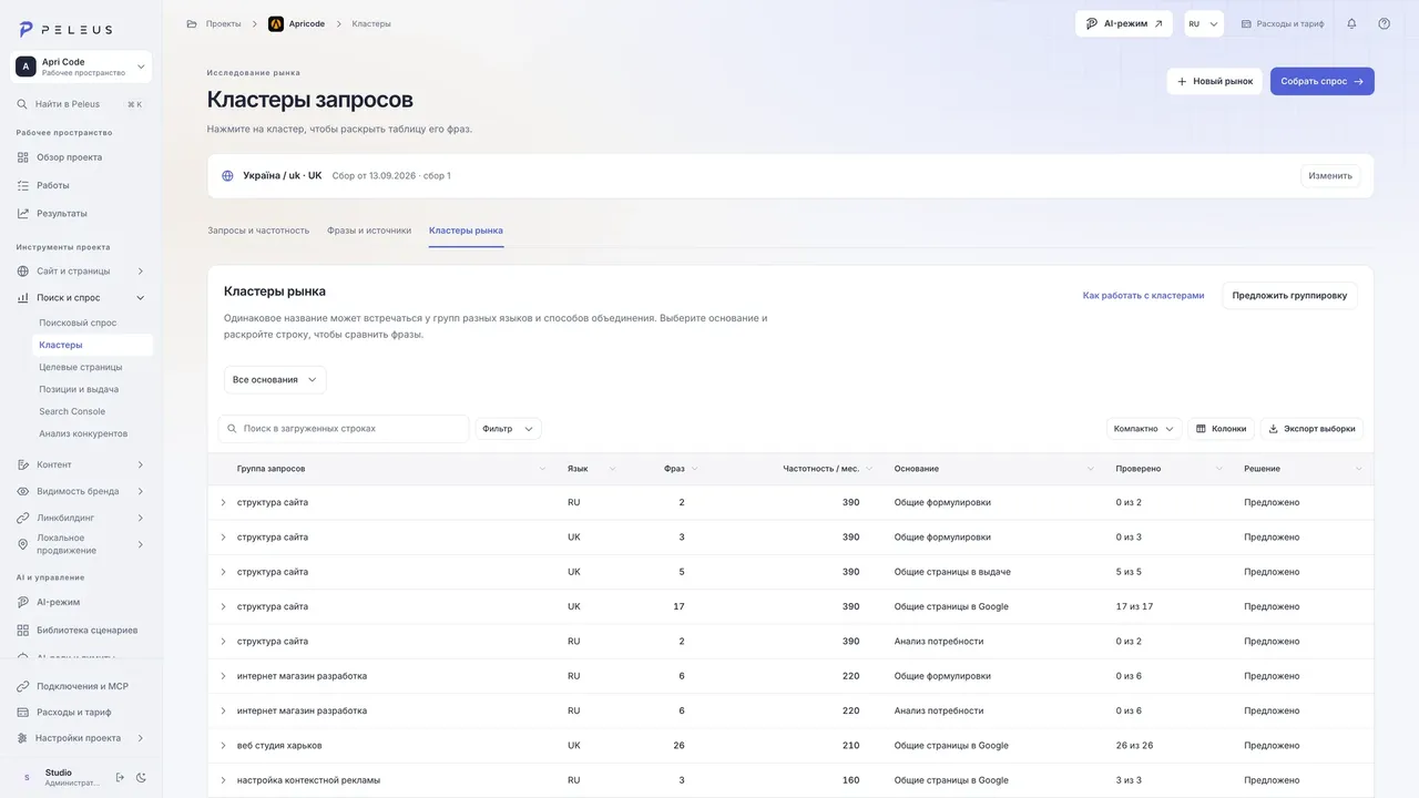
Query groups with their language, phrase count and monthly search volume sit in one table. A row expands into its phrases while the big picture stays in view.
Startup website that builds an audience before launch
A startup with no public product is selling an idea, and selling it to people who already have tools. Peleus is building an AI marketing platform for agencies and teams that run several projects. Demand research, content, AI visibility, link building and local marketing run on one engine. The website had to explain this idea fast and turn interest into waitlist sign-ups.
The first screen sums up the product in one image: a glowing 3D core with branches reaching out to the platform’s modules. Scrolling then walks through the workflow, from signal to decision, action and check, with a simple diagram for every step. Each of the six modules got its own page built on the same logic. The site runs in three languages, and the waitlist button is always within reach.
In a few screens, visitors see what the platform does and why its advice comes from data, not from an empty prompt. Every screen leads to the waitlist, so no interest goes to waste. Is your product still in the works, but you need to sell it now? We can help with SaaS development and UI/UX design. Tell us about your product.
Need a similar startup website that builds an audience before launch?
Tell us about your task — we’ll put together a solution for your business.
Related services